Lost and Found, Page 7
Dec 27, 2014, 7:25:52 PM
How It's Made: Lost and Found - 7
Merry belated Christmas everyone! This is the last page to be posted for 2014, and this article below is about how I made it:
Storyboard
Here's the original storyboard. When I drew it, I left the middle of the page out. I knew there was going to be a quick action bit now that Kamiko and the Wolf were about to meet again. I originally wanted one giant picture of her taking a slash at him with her parasol blade, but all of my quick storyboard ideas didn't pan out, so I just left the block of space empty and wrote "3D sword swing pre-vis." I figured I'd mock it up in Blender or at least grab my umbrella and figure out how to do a cool pose with a sword later on.
Rough Pencils
There's a bit of copy paste with the top panels. Panel one and three have the same background, but that's to show continuity of the wolf lunging after the rabbit. For panel 2, I took her right arm and copy-past-flipped it to make her left one that way she would be symmetrical in her pose. Ultimately, the shading would give it a different look for each hand, and technically the sketch would never see the light of day, but now that I'm doing these blog posts you can see all the shortcuts I'm making. :)
The big open wound in the storyboard was that sword pre-vis. I grabbed my 500 yen Japanese umbrella and tried out different "cool" poses -- I'm sure I looked like an idiot doing this in my living room. :) I imagined the scene as the wolf runs towards Kamiko blind to her because he's after the hare, and she takes a swing at him. I wasn't able to come up with a suitable single frame that would describe that entire sequence of events. It would need more frames, but I only had that much space.
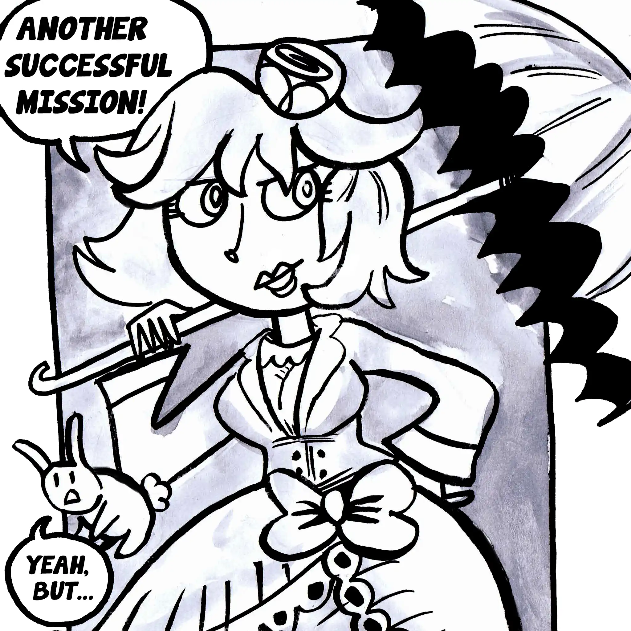
I wanted to do something akin to one of those really wide angle shots that you see in samurai films/anime where the two opponents strike and then are on opposite sides. The samurai puts his blade away and the other guy in the distance, behind the hero, falls. Even as one frame that wouldn't make much sense. It needed setup. What was the easiest way to do that? Sure, I could draw Kamiko winding up for the fight, but I've drawn so many pictures of her winding up and it would make the camera feel static and at a distance from her. Plus, admittedly, to do a lolita dress is actually time consuming. But that's her style. High heels are her style too. You know it's her even if you can't see all of her and it's relatively easier to portray in small frames. So the first frame is her standing calmly, then the next she draws her foot back making a line in the dirt with her stiletto and the sword is flipped over. You can imagine the rest of her is posed. At least that's the idea.
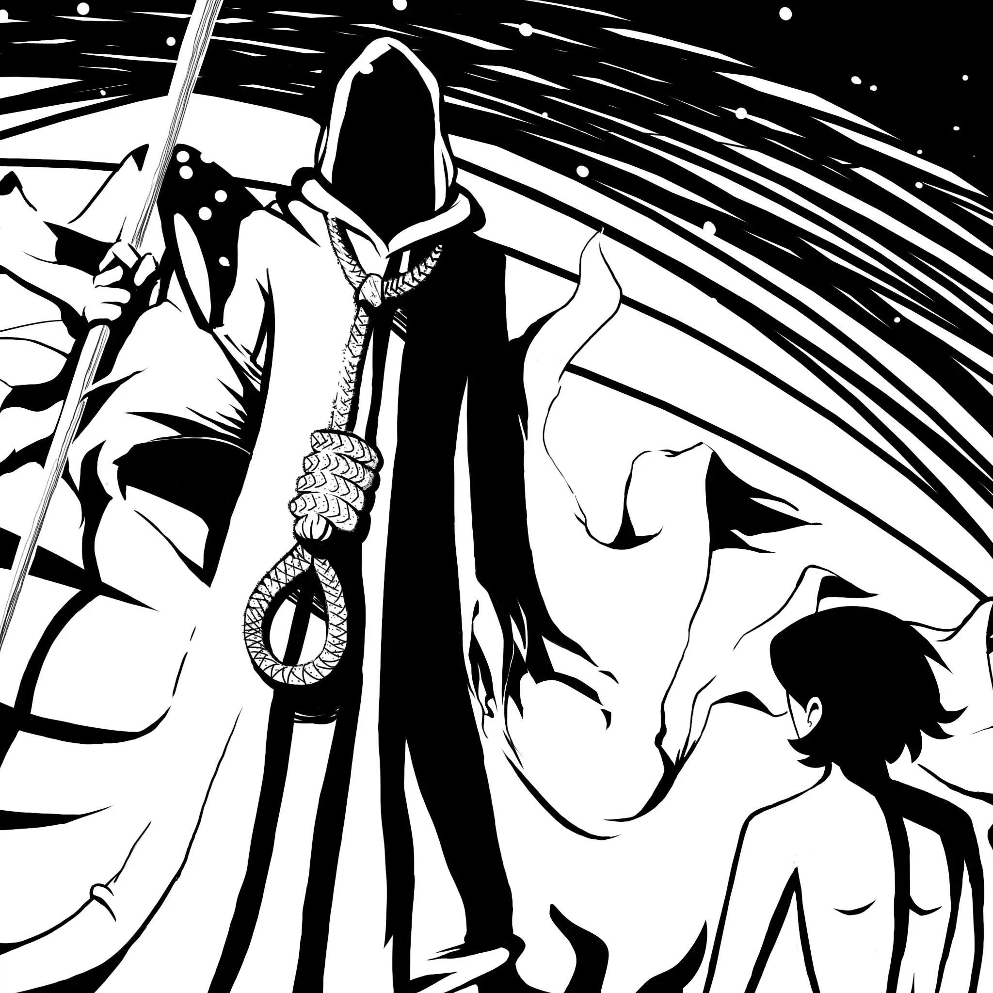
Continuity-wise from the previous page, maybe it's off. In the previous page she's ready to fight whatever comes out in the woods, but the first three frames establish that it's Jade. So, everyone would let their guard down a bit. It's a happy moment until the wolf bursts through the same opening in the woods meaning she's got to strike. After the wind up, I could do the long profile shot of the wolf and Kamiko, but there wasn't space for that. It wouldn't be as impactful as having the entire width of the page. Instead, I cut to the shot from the hero's POV with the camera looking back at the loser of the duel. There's the frame of her holding the finishing pose and then the frame of the wolf spurting blood. Usually it means death, but we've also seen Kamiko impale him with her parasol and he survived that.
I wanted to give the wolf a new look too. He wasn't doing so great at the beginning of the series having been poisoned and then imprisoned in an earthenware jar. Then there was the first encounter with Kamiko, which he survived, but he's coming undone now. At first, he's shadowed and you just see the empty socket where his left eye was, and in the last set of frames more is revealed to show that he's got a lot more missing. He started the page off with both ears, but now he's missing that as well because Kamiko just lopped it off.
Visual Effects
Finally, here are the visual effects to help make panels pop (hopefully), but I isolated them so you can see that they were on their own layers. Speed lines around Natsumi as the rabbit lunges into her arms. The red for the blood that soaks the wolf's fur and coats his teeth. The little flourishes of Kamiko's sword and the speed lines of Natsumi's punch. There's some SFX as well. I actually just draw the SFX...there's no font I use for it. The "CRA-COW" is one with a calligraphy brush and then given a thick outline. For the wolf getting punched in the face, I drew all of these little particulate bits of blood and sweat and dirt floating in the frame as Natsumi clocks him.
Stayed tune to next Saturday, the first of 2015 with the next page of this chapter and I hope you enjoyed reading the comic and the making-of.


