Catherine Illustration June 2021
Jun 26, 2021, 7:22:37 AM
Catherine Illustration
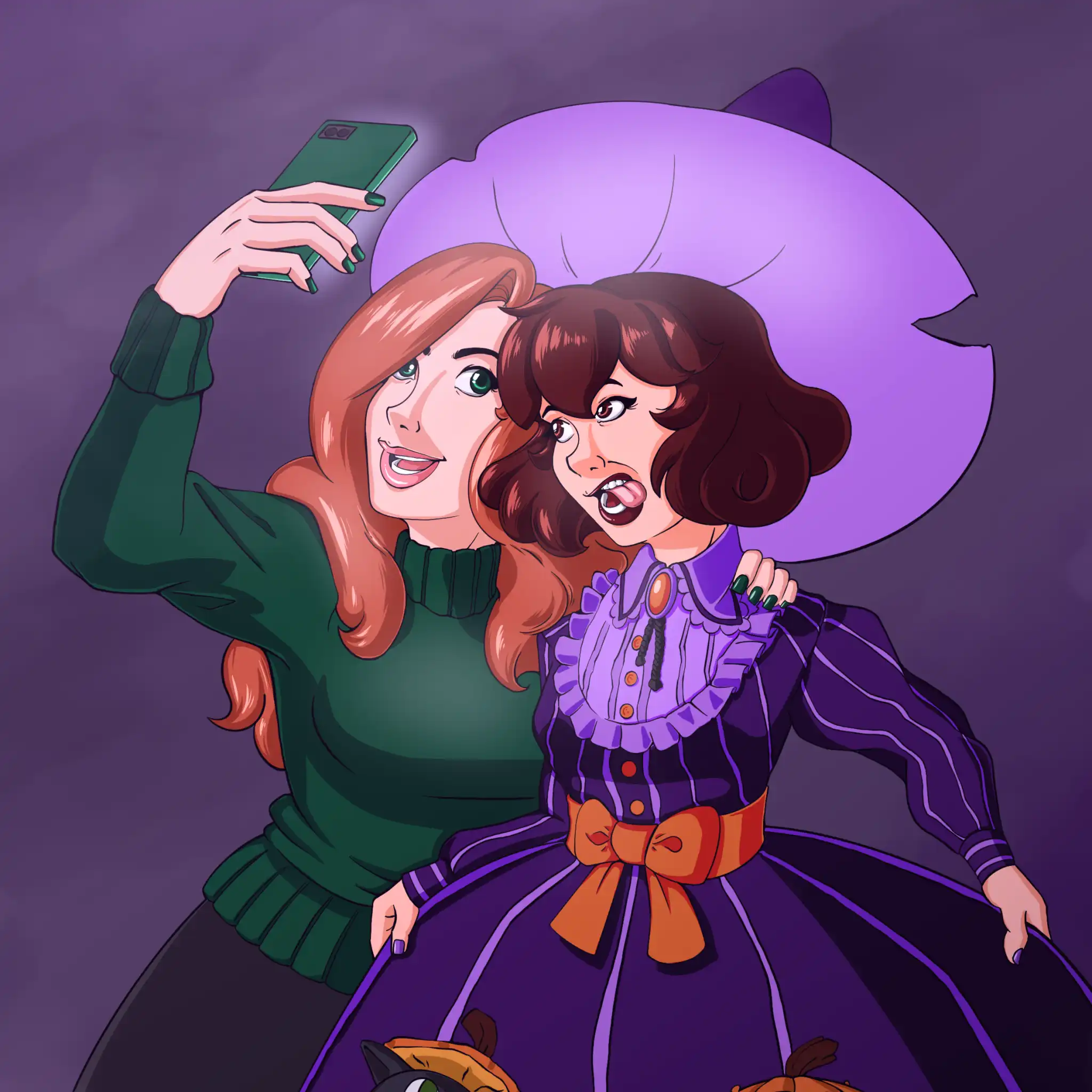
A sketch I turned into a colored illustration of Catherine from March of this year.
Art Process
One thing that's made my life easier is how I do grayscale and color shading.
I used to do every little thing on its own layer. So her zipper and rings would be on one layer. The dress on another. The hair on a third. The face on a fourth. And so on.
It's time consuming to figure out where everything is. But in those layers I'd do the flats, make a new clipping layer for the shade and the highlight. They'd all be grouped together.
Hunting and pecking for layers is time consuming.
Now my process is like this.
- I ink everything on one vector layer.
- All of the flats are on another layer. I use Clip Studio's reference layer for the inks so I can stay within the bounds. It's not perfect especially when the inked areas become really narrow, but I'll go in and manually color it.
- Here's the trick to shading. I shade everything on one layer clipped to the flats layer. I use a pinkish color and shade everything using a combination of the g-pen tool, lasso, and paint fill. When I'm happy with it, I set the shade layer to multiply and it effectively creates a nice cel-shaded look with the flat colors below.
- Similar trick with the highlights, but sometimes I still pick the flats and pick a lighter color for the shading.
- Once that's done sometimes I'll do some effects like add a glow to the background or whatever or add some glow to the highlights like I've done for this illustration.
Here's an image of the layers for this illustration:
A small number of layers for this illustration and I've poorly named my layers because I'm chaotic and evil like that.
I don't add grain or anything else. I like the cel-shaded anime look and that's what I'm going for, and on top of that my work's all digital.
Shading Layer
Here's an image showing how the shading works. It's pretty simple. On a new clipping layer over the flats I shade with a light pink color.
I then set that shading layer to Multiply and you get the cel-shaded look above.
More Color Art in the Future?
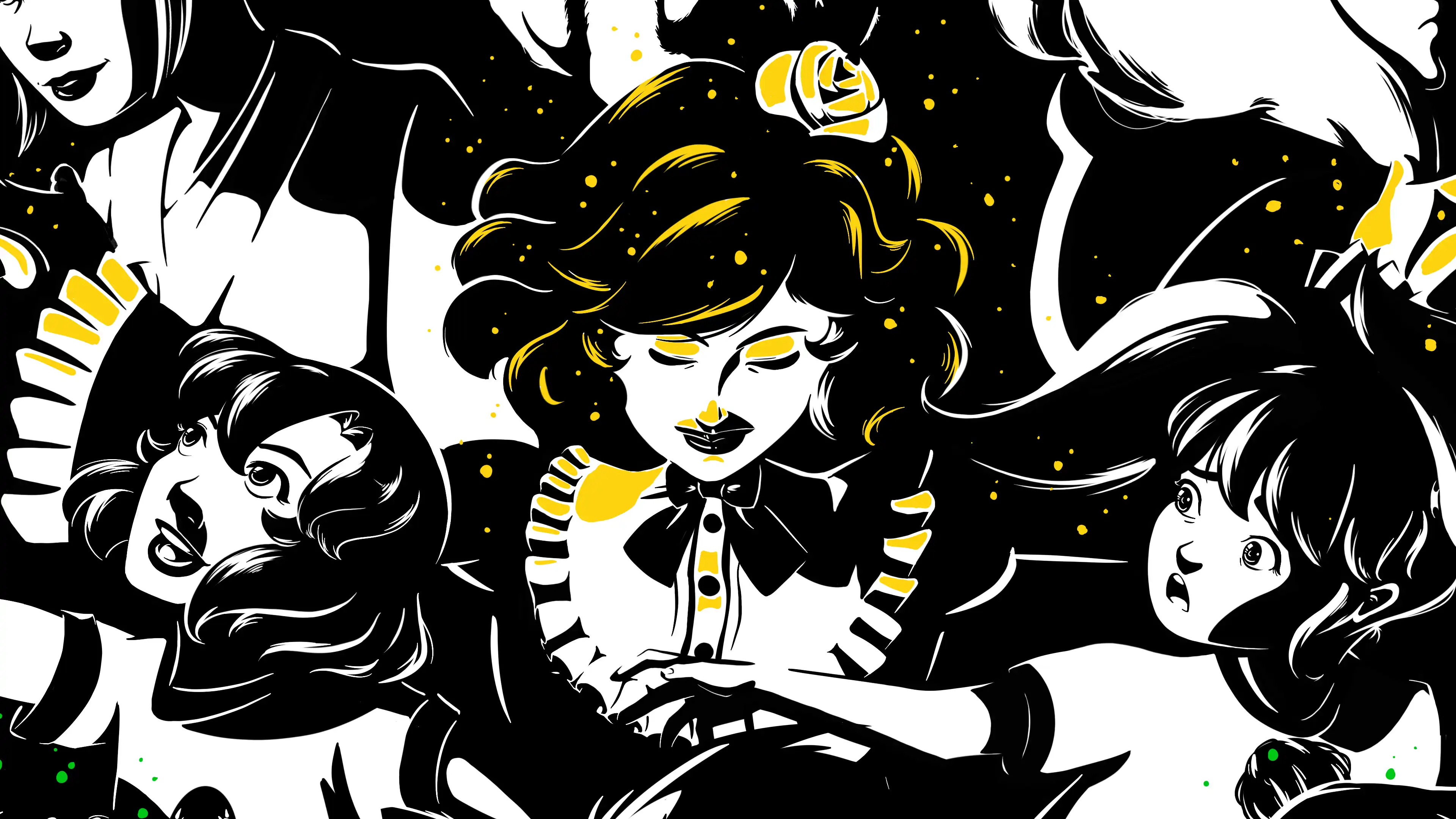
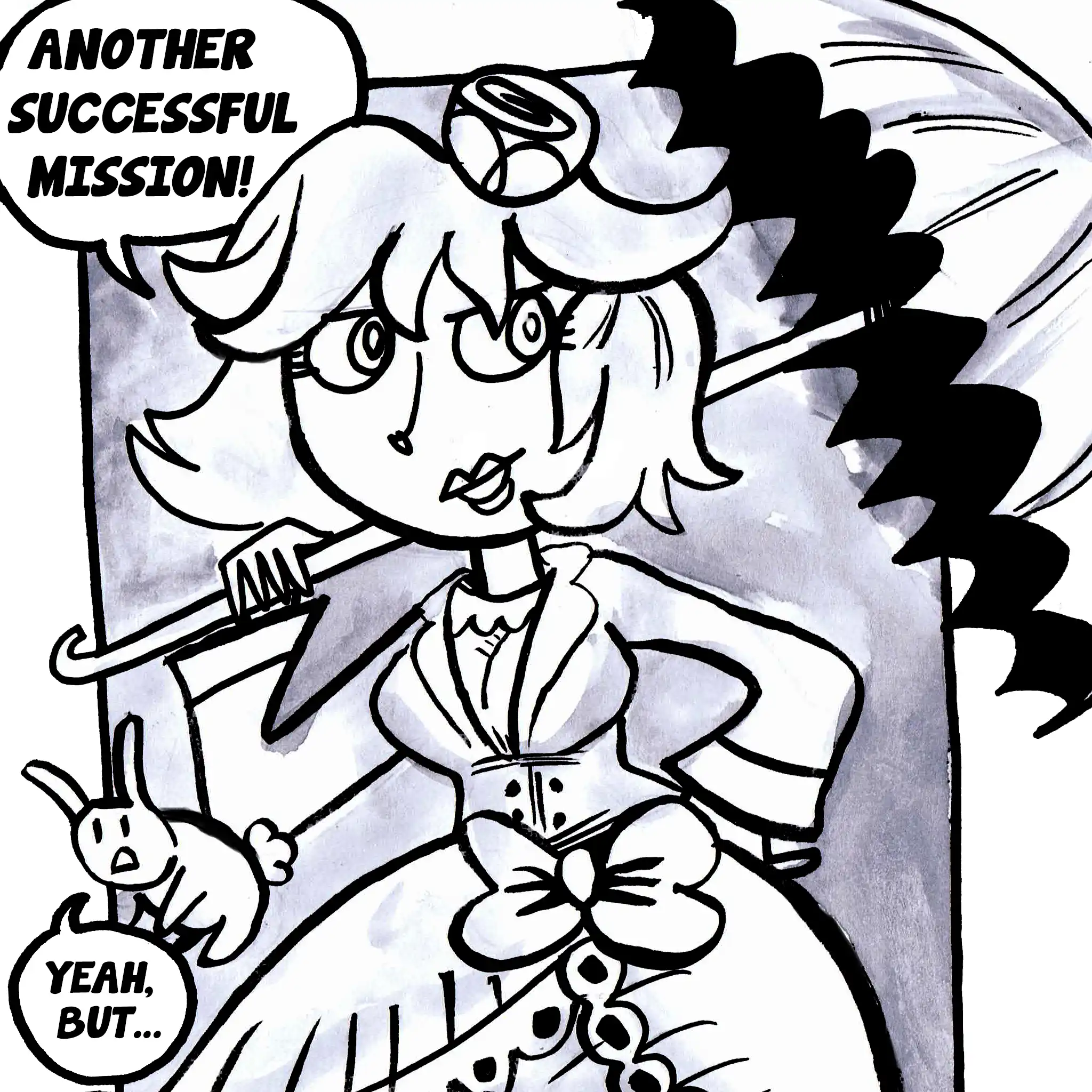
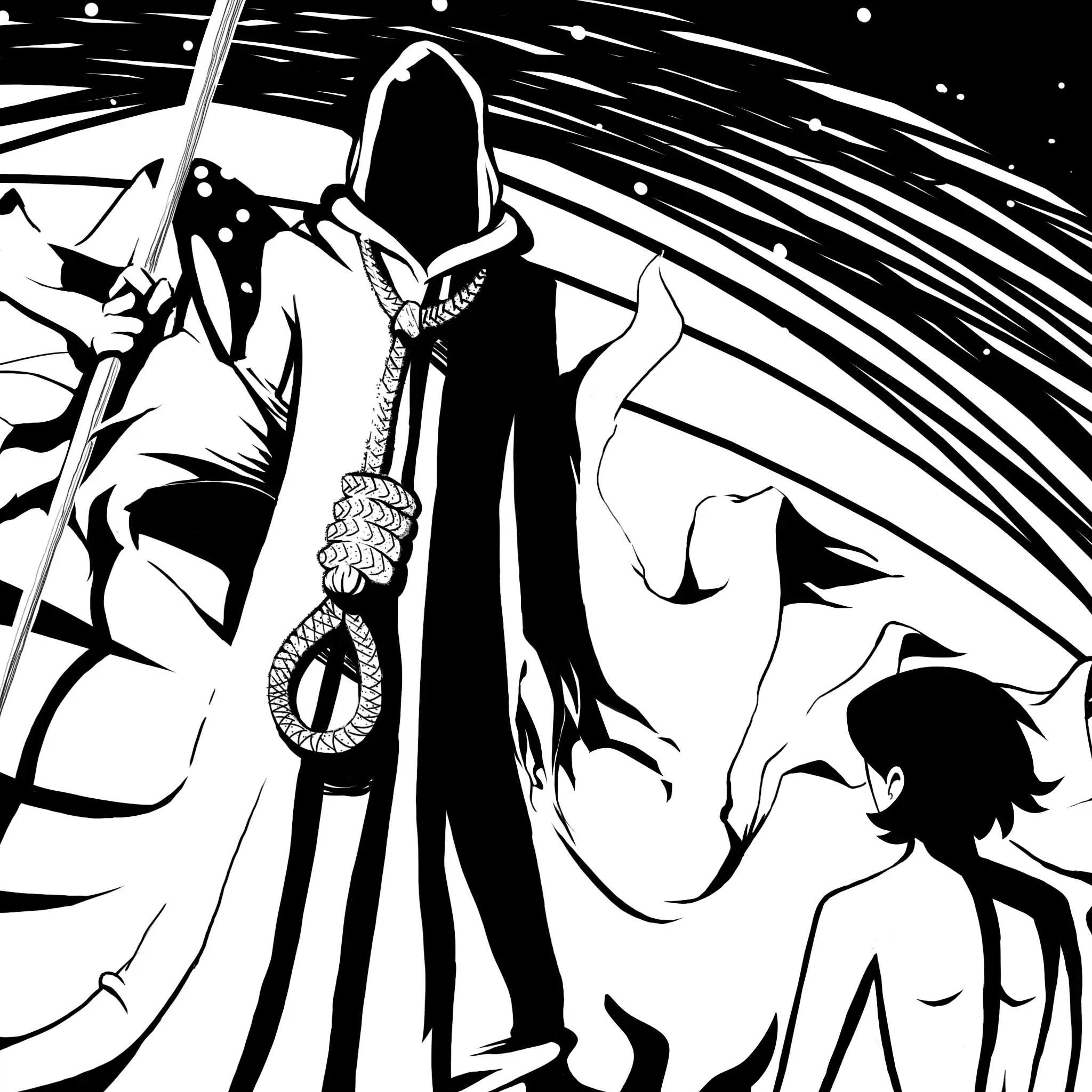
I've been doing art in color lately for the Webcomic Underdog anthology comic.
BTW, I've also completed my anthology entry, so I'll be moving back to doing the comic.
I'm considering doing some color pieces for the actual comic now that I've gone through it. But my main concern would be backgrounds. I feel like grayscale allows me to get away with having cheaply rendered backgrounds, and Magical Girl Kamiko is an exercise in balancing getting comics done and making them look nice. For the anthology piece, gaussian blur became my best friend so I could get away without having to do a lot of details. Gradients for backgrounds as well.
For the website's comic, I'm doing all the tricks I can think of.
- Merging photography (my photos) with 2D artwork
- 3D backdrops and posing characters in 3D
- Toon shading 3D
- Tracing my own 3D stuff on occasion.
- I've even posed, snapped a photo, and drawn over that
- Or, yes, straight up drawing the art -- omitting shading or inking and going with sketchier pencil artwork
Whatever gets the job done, because my main goal is to tell a story.
Comics Evolved
But as I go along, my ideas on how things should work are evolving...
For instance, with the new website, I'm no longer beholden to the strict size I setup on the old Wordpress site. Things don't have to be only 1140 pixels across -- yeah, I had that as a hard limit because of the javascript comic reader.
For the new site I want to explore going big. 4K big even. That could really change how pages look and how things get drawn. Of course there are some other considerations such as mobile and folks with non-4k screens. But, I'm looking towards the future, so why hold myself back?
There's also the potential of doing mp4 video playback at times which means animation could be more of a thing.
There's even the possibility of 3D and interaction with more javascript -- that's a whole thing I haven't really explored yet and I'm looking forward to it.
Magical Girl Kamiko, as I said in the beginning, was going to be experimental. I'm on a digital platform. The story doesn't have to be beholden to comic pages and it doesn't have to be a certain way. It should be afforded every luxury the digital landscape gives it -- animation, interactivity, imagery, and even (hyperlinked) text-based storytelling.
Things will probably be mostly comics, but I look forward to trying new things regardless.
Have a great weekend, and see ya next week!


